- 項目:Saga-Ken Medical Centre KOSEIKAN
- 設計:ujidesign
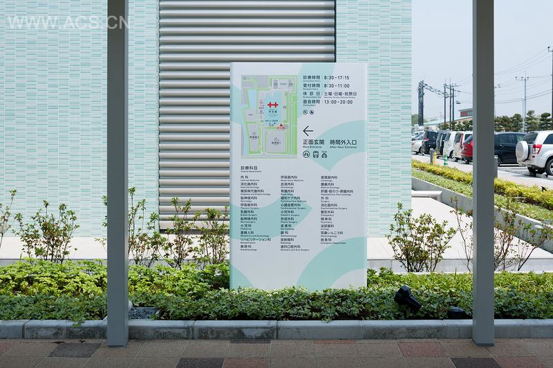
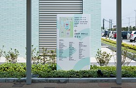
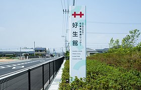
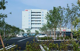
The Saga-ken Medical Centre KOSEIKAN is a health care facility that is successor to a medical institution from the old Nabeshima feudal domain going back 150 years. We revamped its visual identity (VI) planning when it moved in 2013. The symbol that it first used was a double cross, but over time this turned into various shapes, and started to become confusing. We thus restored the original, simplest version of the symbol, and created a manual that is aimed at the use of modern shapes.
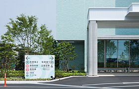
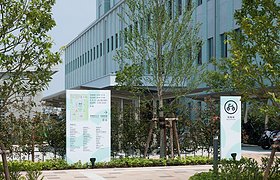
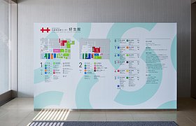
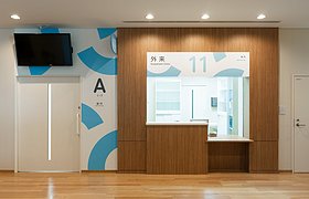
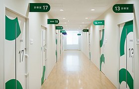
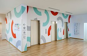
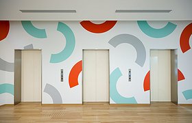
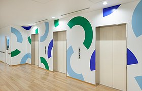
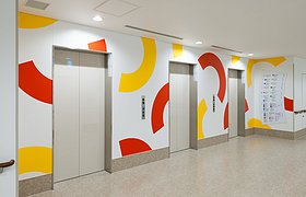
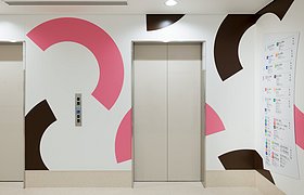
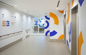
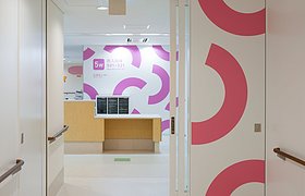
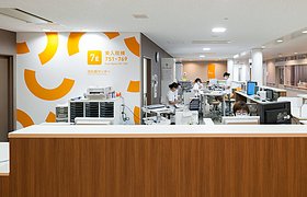
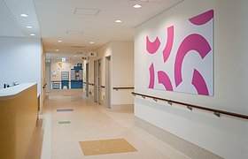
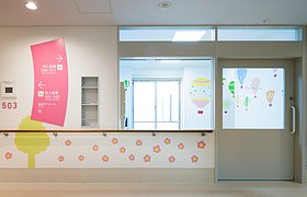
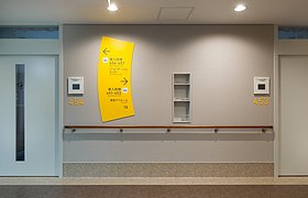
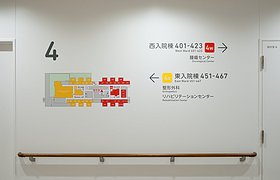
We developed the sign layouts d on the theme of “wind,” which is the symbol of Saga Prefecture. Using the shape of a fan, whose shape brings to mind wind, we created signs of various shapes and colors both inside and outside the facility. For the sake of clarity, we made the signs a different color for each diagnosis and treatment department. With these colored fans, we are aiming to create bright and fun spaces throughout the building, and at the same time make the different areas more identifiable.